Brandon
A brand-new, age-old answer to logistics
Our client had a success story on its hands. Its subcontracting business had evolved and expanded into e-commerce logistics, and that side of the business was growing fast. So fast that it had outgrown the parent brand. To realise its vision for both businesses, our client gave us at 358 a straightforward brief: create a stand-out brand for its e-commerce operations. And that’s exactly what we did.
Meet Brandon, an agile, flexible and inherently human partner among the rigid logistics giants.
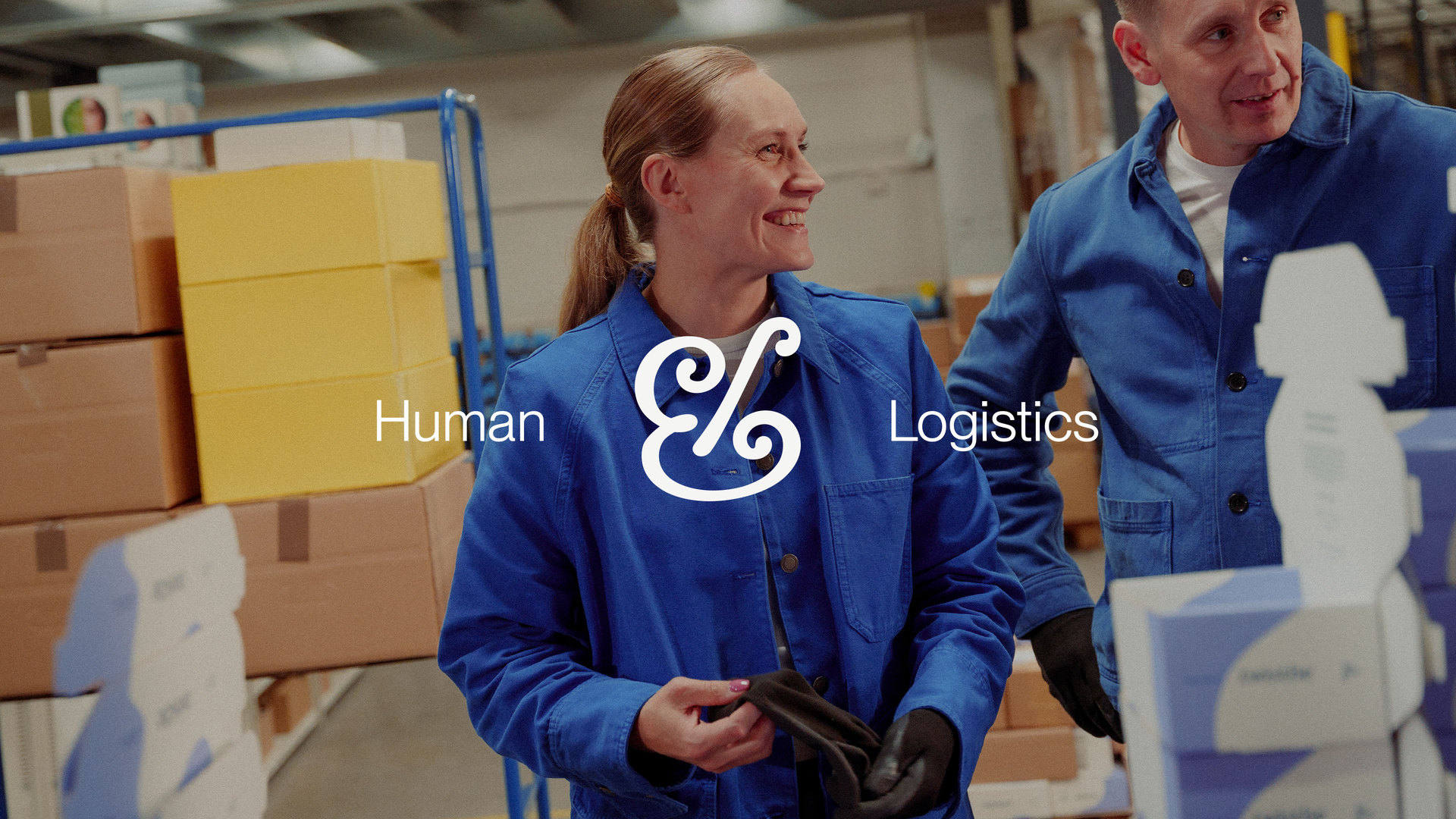
Brandon looks and sounds nothing like a traditional logistics company – and nor should it. Its vision stems from a simple truth, highlighted by comprehensive market and target audience research: people value people. While robots and machines offer handy tools for a smoother everyday life, the human experience remains unique. That’s why Brandon takes on the role of a passionate expert and personalised customer service, with a clear promise of human-made logistics.
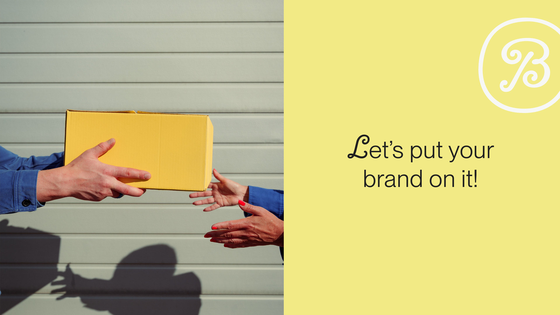
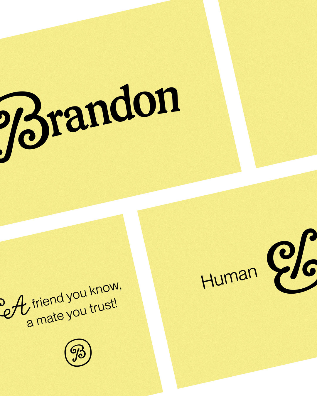
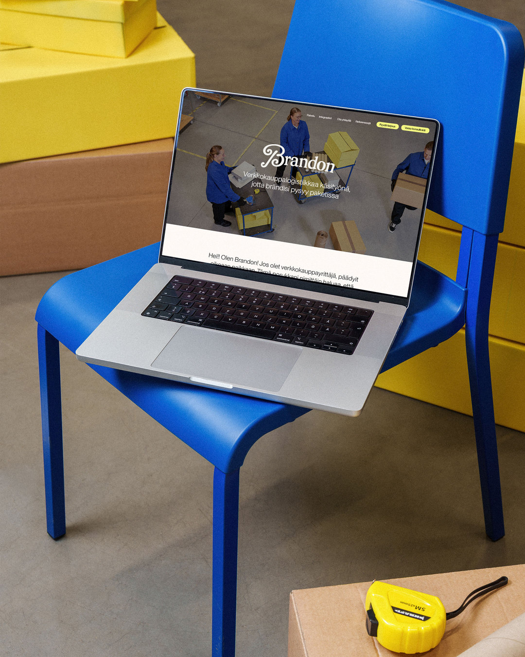
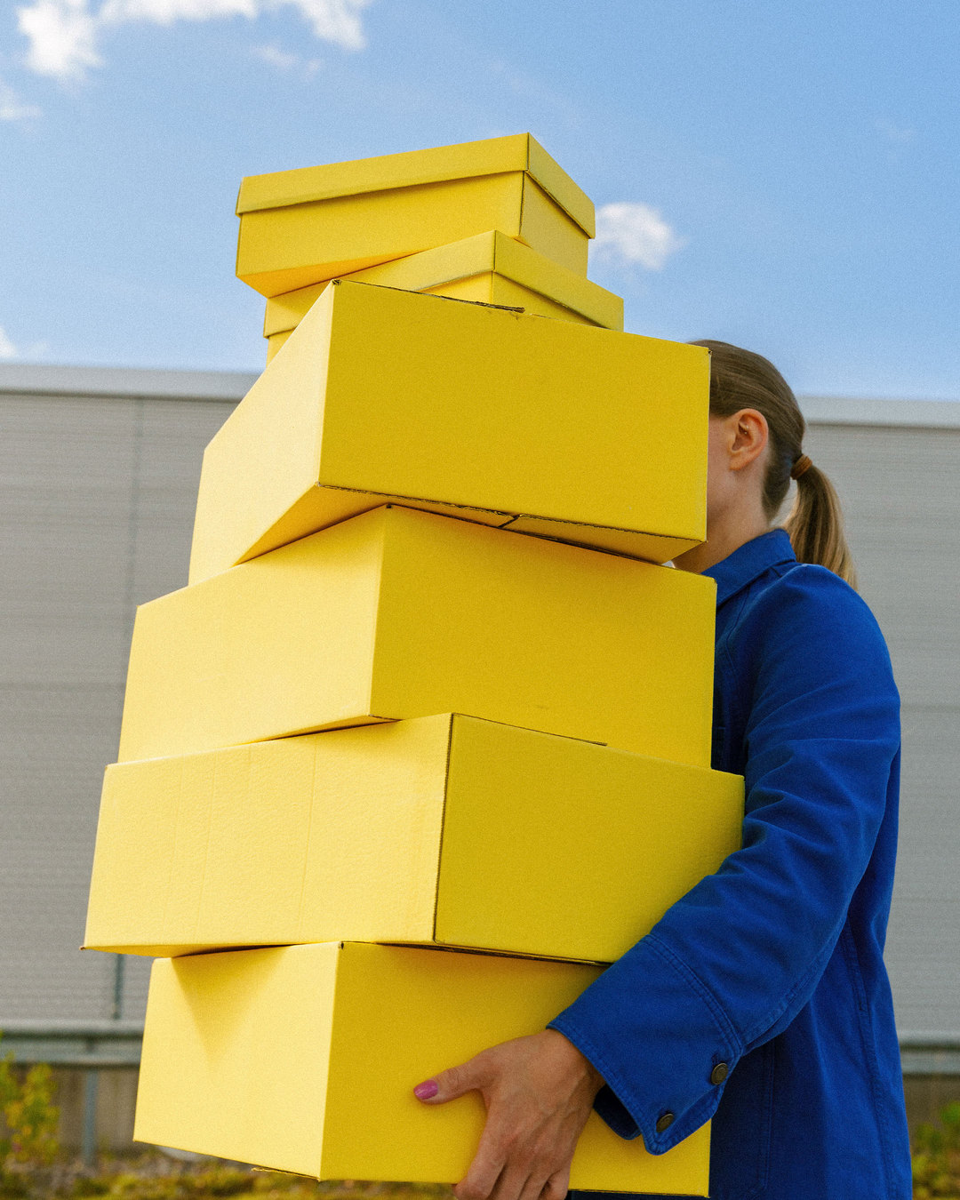
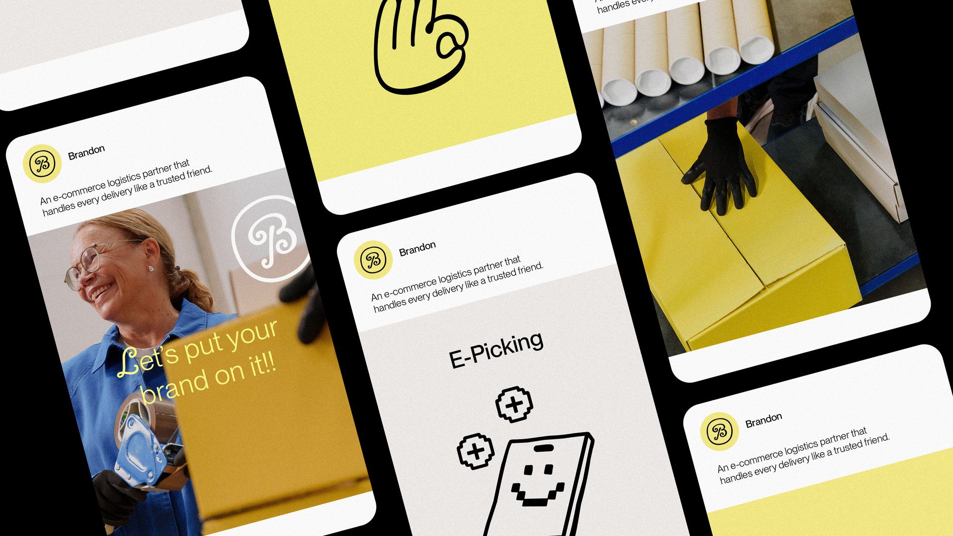
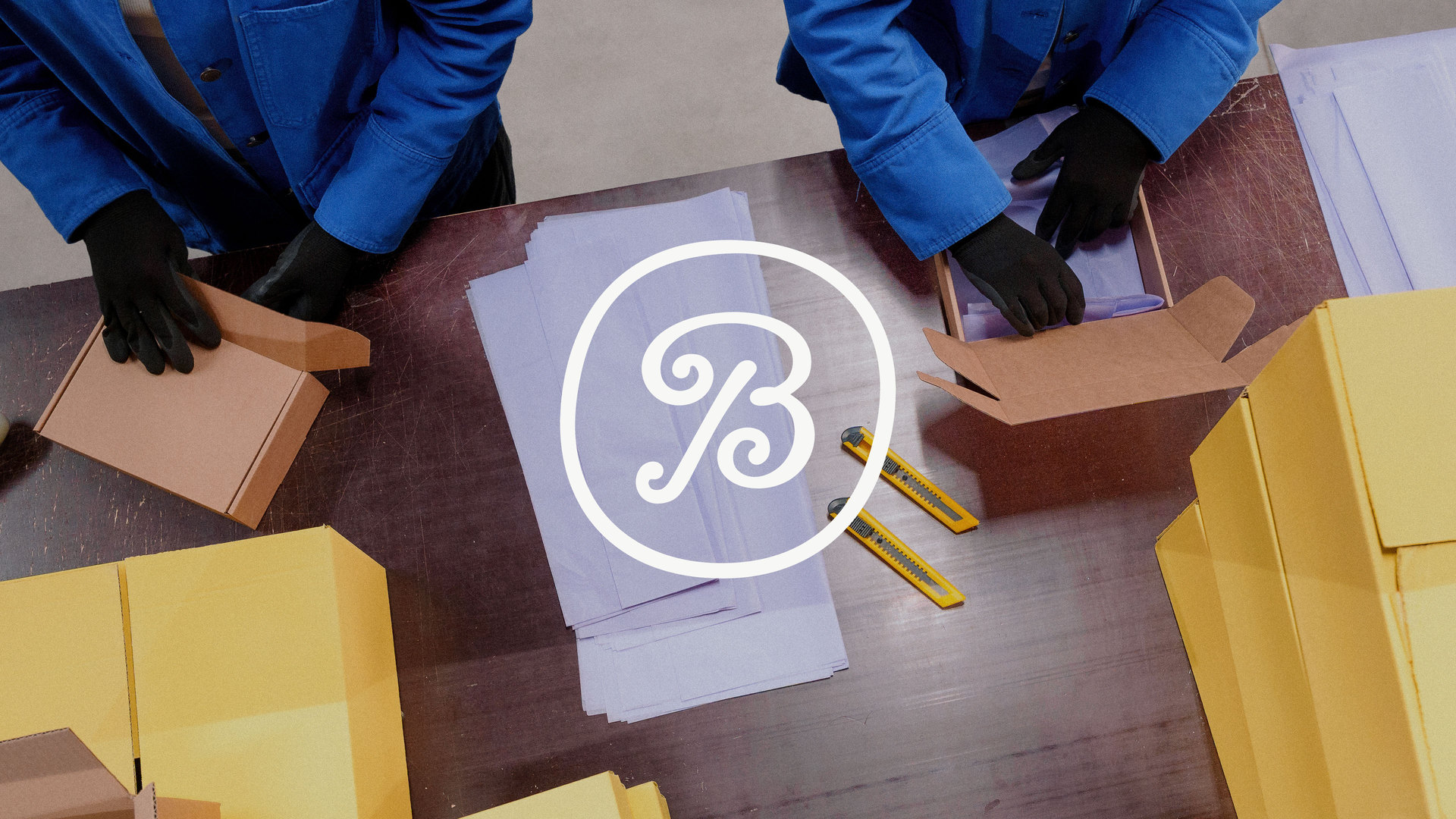
The visual identity is built around the same idea of human craft, with just the right touch of premium, and sets the brand apart as a playfully functional companion. The logo and brand elements carry the softness of handicraft, while the typography and bright colour palette bring clarity, freshness and rhythm. To keep Brandon’s values front and centre, the imagery highlights the people behind the brand and the care that goes into every single parcel that passes through the packing facility.
In a category built on speed and scale, Brandon proves that real success lies in the human touch – a refreshingly new yet age-old answer to the post-digital era.
A huge thank you for collaboration!
Photos and film Janne Savon
Styling and MUAH Saga Piik