Sutela
Pioneer rooted in tradition
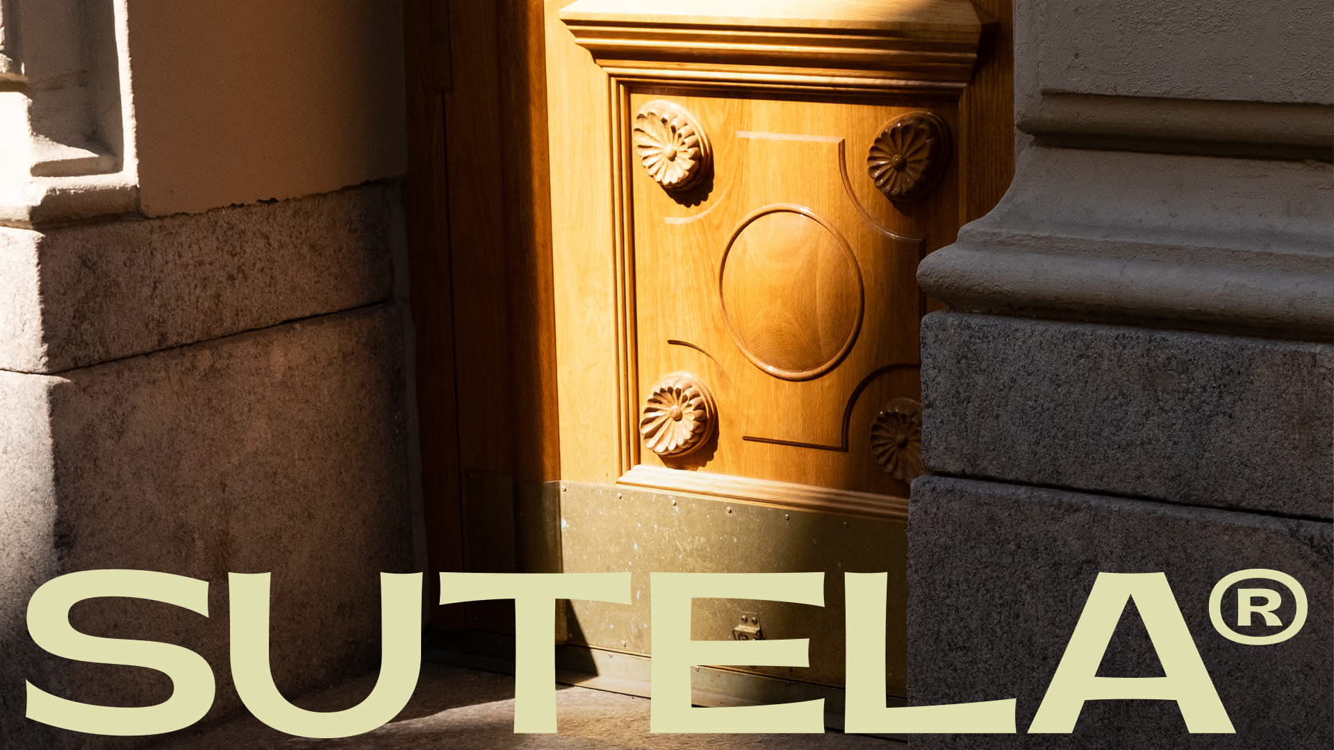
Sutela specialises in solid wood doors and expert joinery. Their previous rebranding had fallen a bit short and didn’t fully align with the company’s future vision or its position as a modern, high-quality maker. Together, we carved out a refined brand identity that reflects Sutela’s design-driven mindset while honouring tradition.
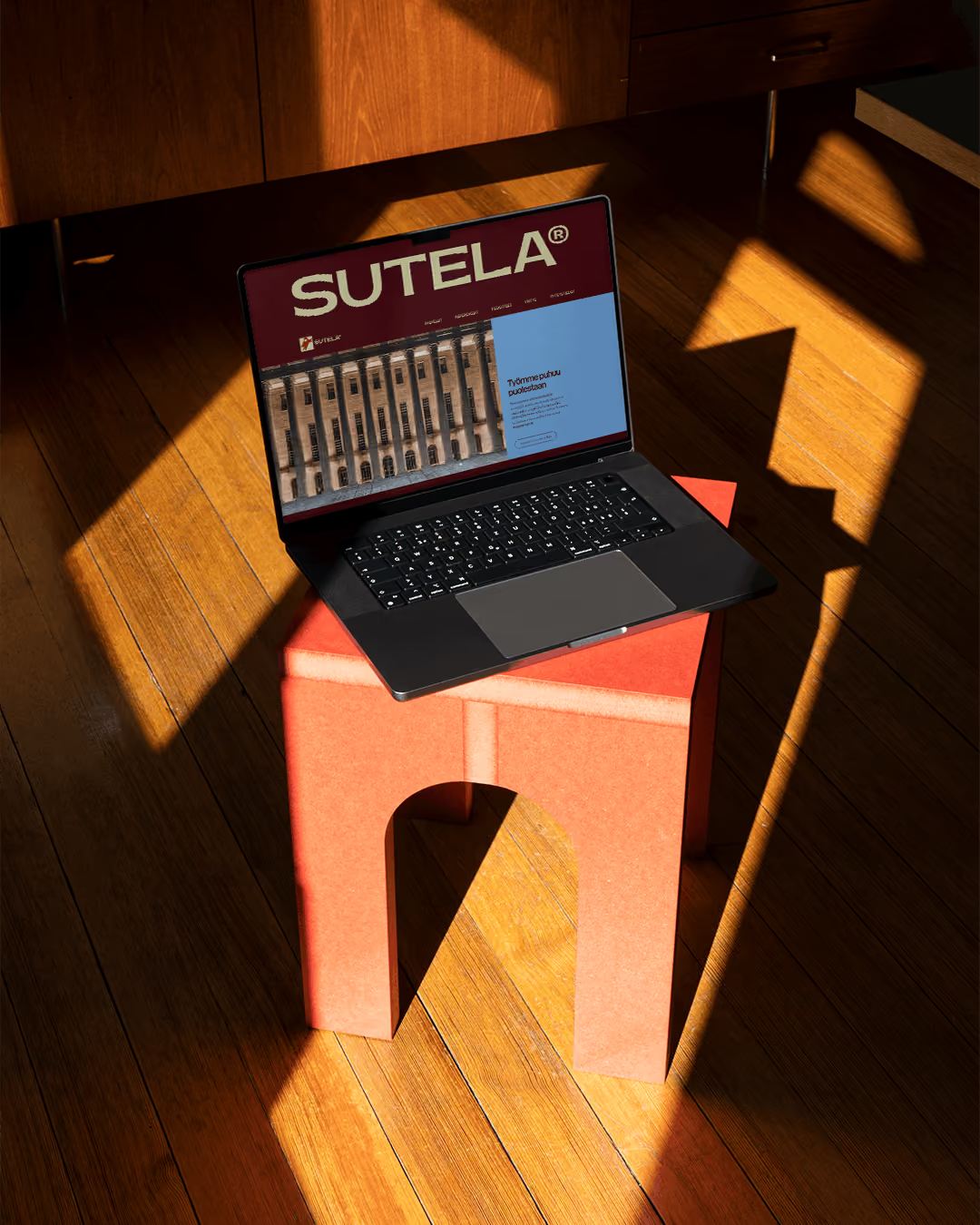
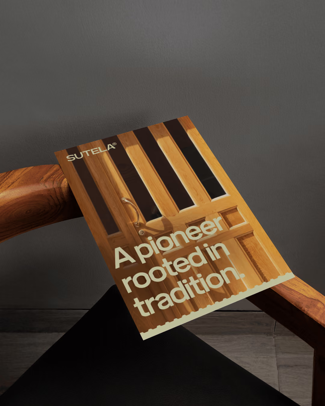
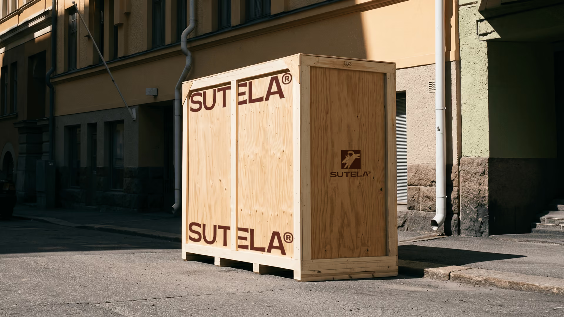
The new identity radiates a distinct artisan spirit. Nordic design-thinking and quality expertise shine through in the architectural detailing, while the touch of grit and roughness mirrors the heritage of craftsmanship throughout the look. The typography is strongly in line with the visuals: modern and chiselled main font, complemented by an accent font that carries the same, quick spontaneity as a joiner’s handwritten note. The whole renewed identity extends seamlessly to the redesigned website.
As part of the renewal, Sutela’s logo received a long-awaited update. We returned to the company’s roots, reshaping and bringing Sutela’s original logo up to date. The illustrated, grinning wolf has an organic and modern feel to it, while adding some needed, playful wit to the brand. Pride towards the roots and craft is heard in the tone of voice too, seasoned with northern honesty and unpretentiousness.
Sutela stands as a leading joinery of the new generation – one with a forward-looking attitude and a vision of a future full of opportunities for the curious. A deep pride in preserving the art of craftsmanship for generations to come runs through everything Sutela creates, and through the renewed brand identity, that spirit now shows loud and clear through all touchpoints.


.gif)